ASDMR · a church with hundreds of local units · 2026
Conectados ASDMR — the whole church in one app, on a Saturday rhythm
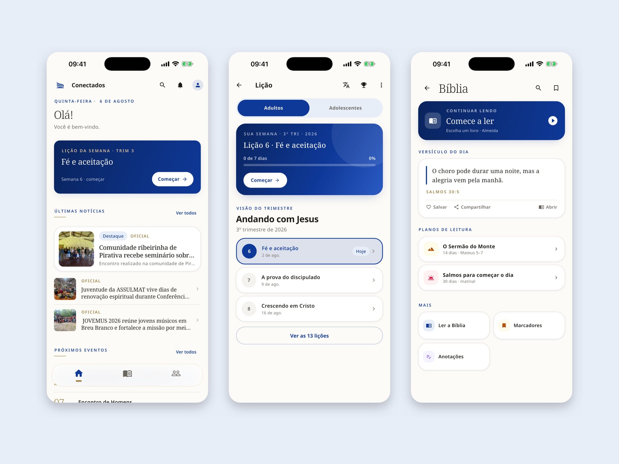
I led the brand and the product behind Conectados ASDMR: an app, a public website and a management portal. In just over three months the app passed 1,500 installs with a 4.8 rating, and half of its monthly users come back every week.
- Role
- Brand manager · product lead · product design
- Year
- 2026
01 Context & challenge
Plenty of content. No place for it.
ASDMR has hundreds of churches in Brazil and a presence in other countries, organised in unions, conferences and local churches. In 2026, church life ran on loose channels: notices in WhatsApp groups, the Sabbath School lesson as a PDF, a printed hymnal, event sign-ups in scattered forms and a website that didn't represent the organisation.
The problem wasn't a lack of content. It was dispersion.
- 01Members
No single place to study, sing and know what's happening at their church. All ages, many on entry-level Android phones.
- 02Leaders
Volunteers without technical training, who couldn't publish without depending on someone technical.
- 03Visitors
A website that didn't introduce the church to someone who doesn't know it yet.
- 04Every unit
Each church communicated with a different face.
The goal: an official app for members, an institutional website for visitors and tools for leaders to publish on their own — all under one brand.
02 My role
Brand manager and product lead.
I defined the v2026 brand, designed the app and the website, set the priorities and made every product decision. I led the development with AI support, reviewing and testing every release.
- 10 months
- from scattered channels to its own ecosystem
- 1,901
- releases shipped
- 123 · 366
- app screens · portal pages
- 1,178
- automated test files guarding brand, access and accessibility
03 What I built
Three products, one brand, one database.
The app, the website and the portal share the same brand, the same database and the same integration with the church's official membership system. What's official about a member always comes from there.
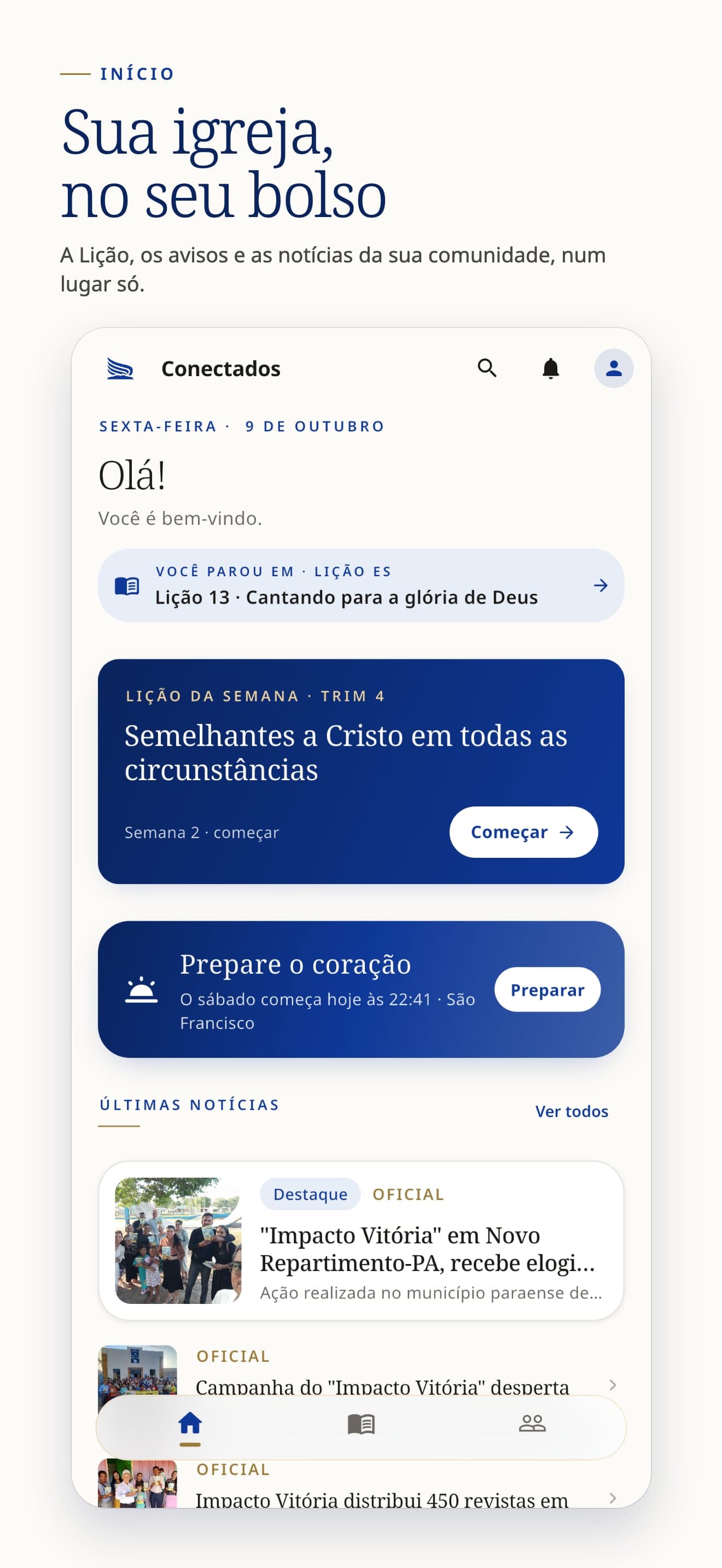
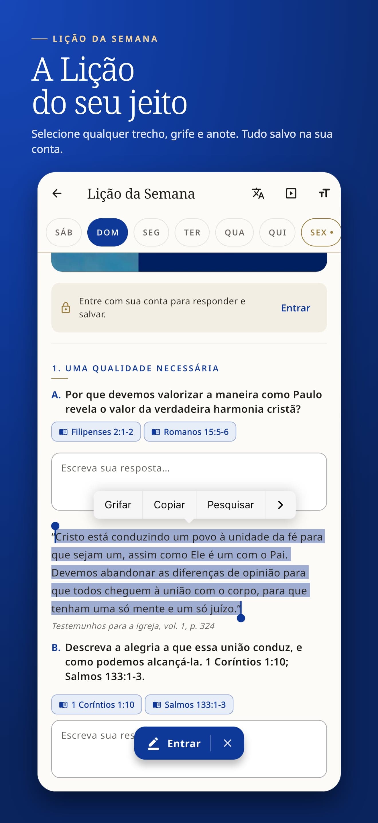
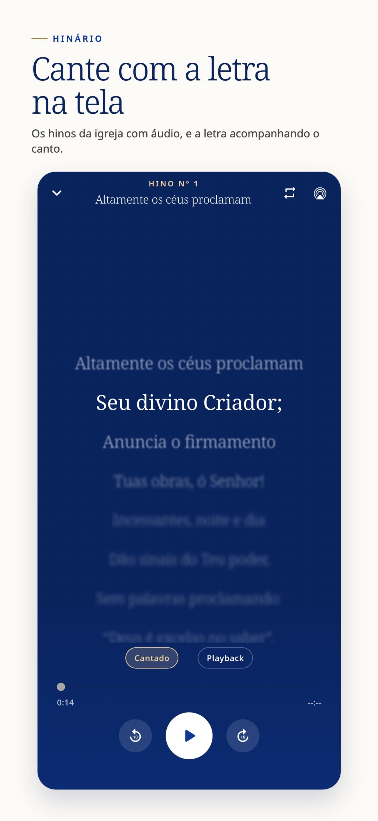
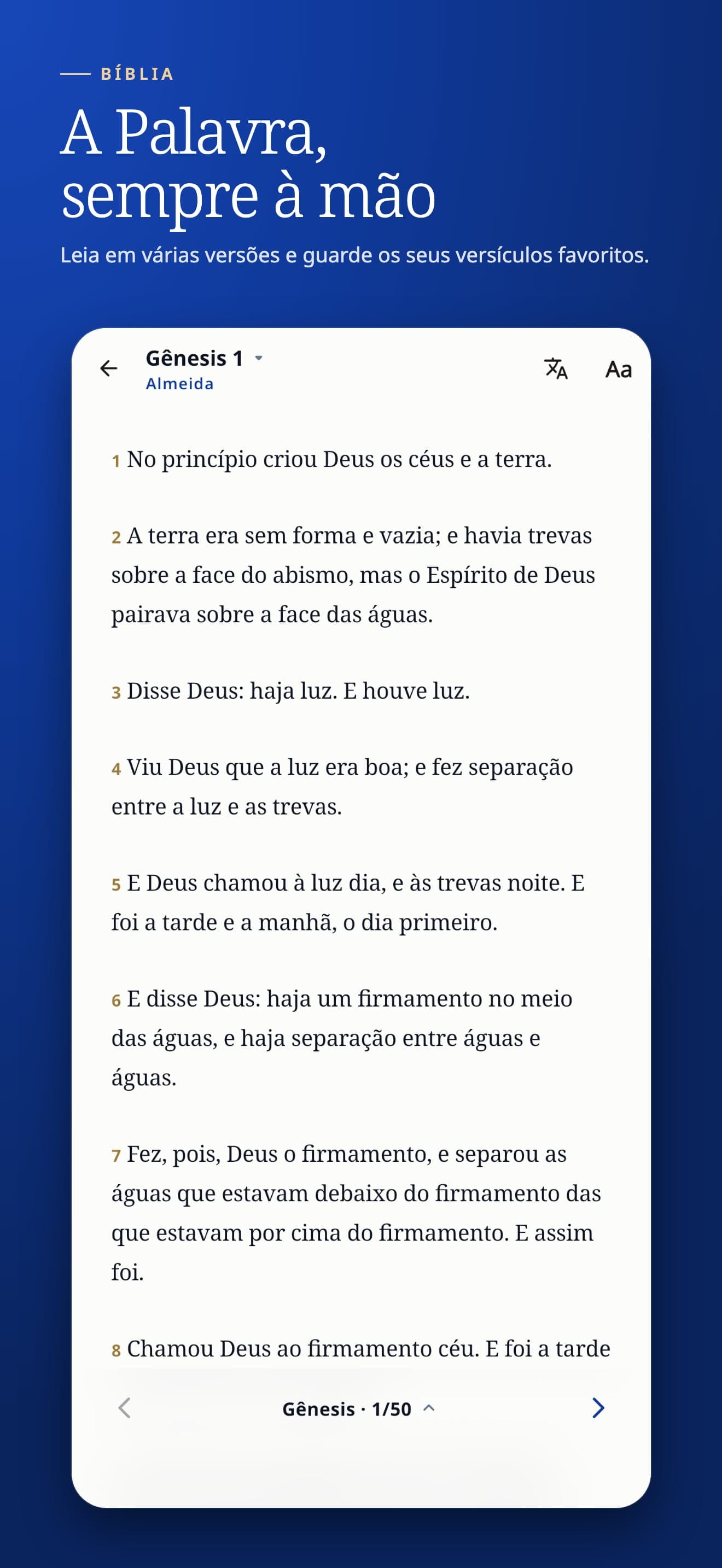
- 01Conectados app · iOS and Android, since July 2026
Lesson of the day with answers and quiz · hymnal with audio and score · Bible, courses with certificates, church music by voice part · news, events with PIX payment, prayers · a digital membership card checked against the official records, with a QR code · study parts work offline, in 4 languages.
- 02Public website · asdmr.org.br
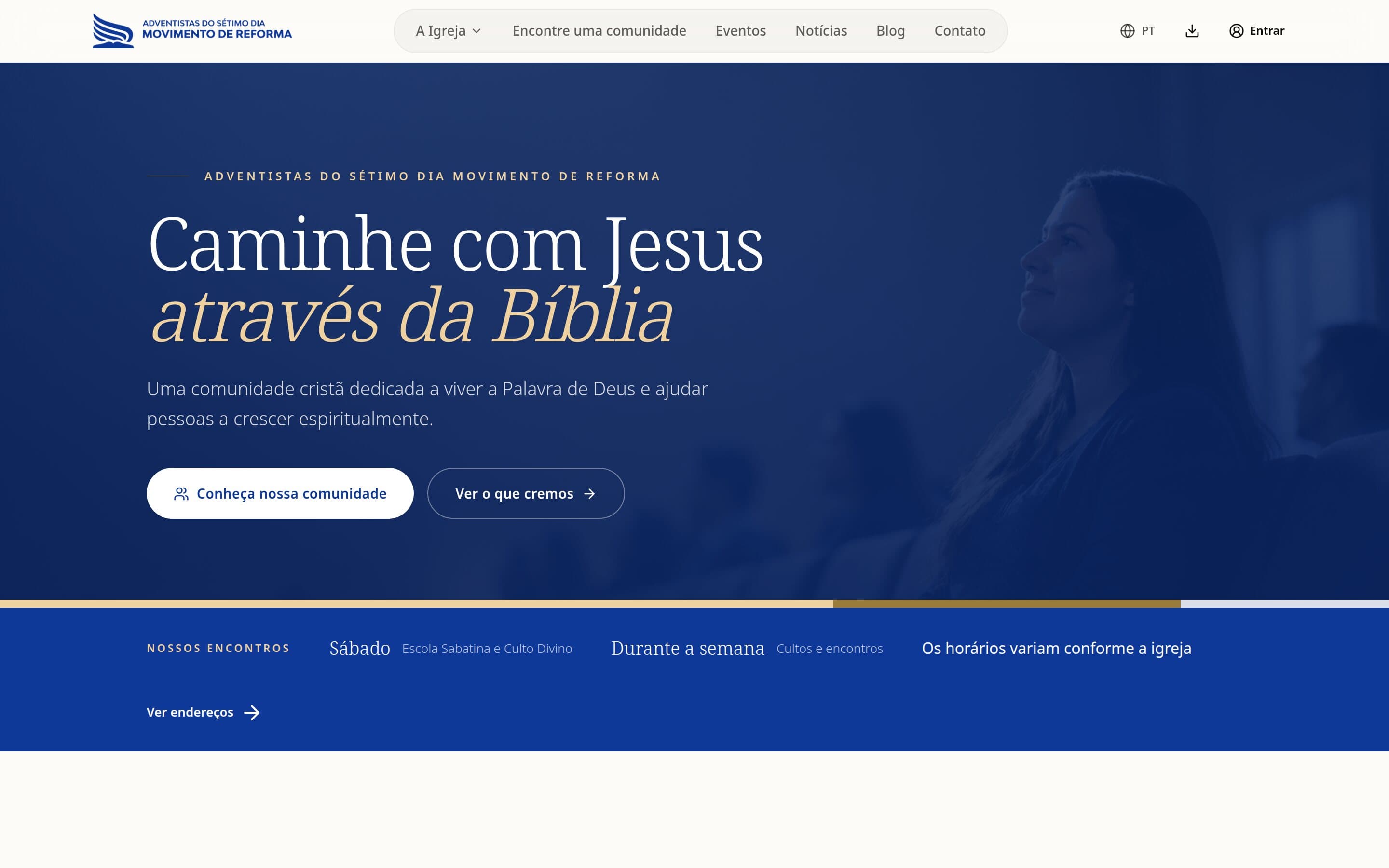
Introduces the church to newcomers: beliefs, history and “Find a community” with churches on a map. One site per union, conference and church, same visual standard. The brand manual, browsable in several languages.
- 03Management portal and tools
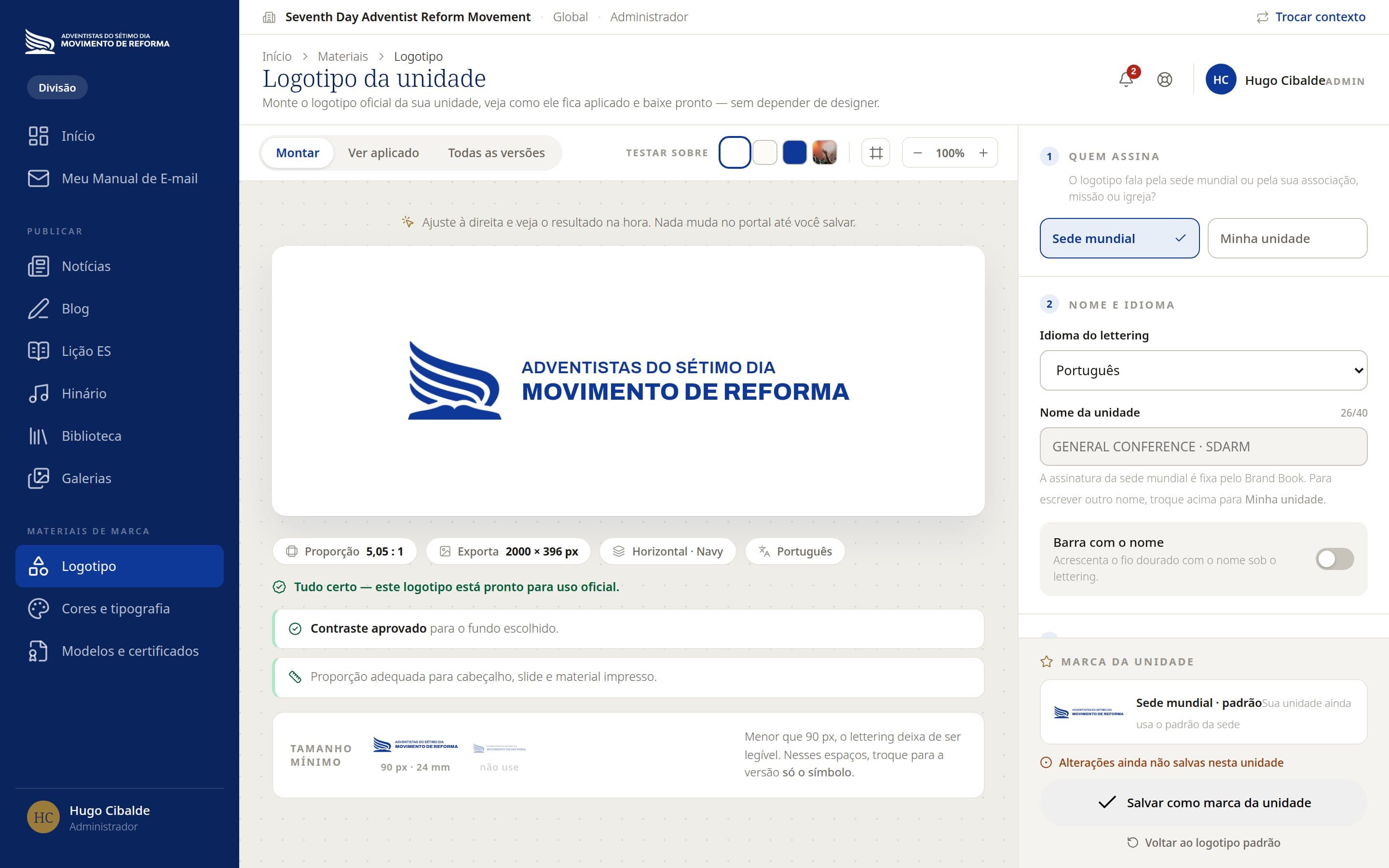
Publish news, notices and events to a chosen audience · ready-made brand pieces (certificates, facade signs, letterhead, posts) · logo generator in several scripts · lesson editor with review flow · app usage dashboard and in-app surveys.
04 Key decisions
Six choices that made the difference.
- 01A brand before any screen
I wrote the v2026 Brand Book: navy #0F3999, gold #9A7B3A, light Noto Serif for titles and Noto Sans for text. App, site and print all come from the same tokens. Why: with hundreds of units publishing, only a written rule stops each church from inventing its own look.
- 02Accessibility as a rule, not a fix
I measured every colour's contrast and swapped gold for navy in small text on light backgrounds (gold gave 2.7:1, below WCAG AA). Touch targets of at least 44 pt, text up to 1.6× without breaking, screen-reader labels on every button. Why: many members are elderly.
- 03Work offline where the church is
The lesson, hymnal, Bible and downloaded music work offline. Why: many churches have no signal, and the moment of use is the service itself.
- 04The official records are the source of truth
The membership card comes from the official membership system, not a parallel sign-up: photo, church, status and baptism. If someone is deactivated there, the card says so and admin access is blocked. Why: a credential is only worth something if it can be checked.
- 05Listen before choosing the subscription model
Instead of locking the lesson commentary behind a paywall from day one, it stays open for a period, with usage measured and a short in-app survey. Why: decide with data from real users, not assumptions.
- 06Doctrinal content goes through people
Study texts reach the app only after a responsible person reviews and publishes them, with a review link for pastors and editors. Why: a doctrinal error reaches members as if it were the church's position.
05 Results
The app lives on Saturday.
In just over three months on the stores, the app became part of the study routine: half of monthly users come back every week, and retention goes up from day 1 to day 7 — because people return the next Saturday.
- ~1,515
- installs (325 iOS + 1,190 Android)
- 52.4%
- come back every week (weekly ÷ monthly users)
- 4.8★
- from 32 ratings; all 16 written reviews are 5★
- 16
- countries, in 4 languages
Daily active users on Android in October: 55–120 on weekdays, 214–291 on Saturdays. The biggest jump, +202 devices in one day, fell on a Saturday, 5 September.
That confirmed the product bet: the Sabbath School lesson is the reason to open the app. In the in-app survey, 65% came for the lesson and 18% for the hymnal (17 answers, still a small sample). Members follow the class on their phones, and churches now promote the app during the service: 74% of Android installs came from direct links, not the store.
| Indicator | Result | Source and period |
|---|---|---|
| Installs | ~1,515 (325 iOS + 1,190 Android) | stores, to 20 Oct 2026 |
| Active Android base | 993 devices with the app installed | Play Console, 20 Oct |
| Monthly active users (Android) | 766, +12% vs the previous 28 days | Play Console |
| Activation | 78% of installers opened the app | Play Console, 6 months |
| Weekly return | 52.4% (weekly ÷ monthly users) | Firebase, 23 Sep–20 Oct |
| Retention | 17.5% day 1, 22.3% day 7, 21% day 14 | Firebase, 23 Sep–20 Oct |
| Time per session | 9 min 47 s | Firebase, 23 Sep–20 Oct |
| Rating | 4.8 from 32 ratings; 16 written reviews, all 5★ | App Store + Google Play |
| Stability (Android) | 0.37% crashes, 0.09% freezes — below Google's limits | Play Console |
| Reach | 16 countries; 86–92% of users in Brazil | stores |
The average rating alone is a small sample; it counts together with the reviews below. iOS retention is left out because Apple's sample is too small.
“Finally, our church's official app. Better and more complete than all the others we used to use.”
Review on App Store
“I find all the news and event information from the church in one place.”
Review on Google Play
Reviews also flagged problems, and they became releases: hymnal audio (fixed in 1.5.0), Bible text in the lesson (1.4.0) and the wrong lesson date (1.2.0). Each report was answered and fixed, and the app later got its own “Help and suggestions” channel.
06 What I learned
The data showed me the product I really had.
- 01Follow the use, not the plan
The app launched with news and events on its home screen; usage showed a Saturday study app. The roadmap moved to the lesson, the hymnal and the commentary.
- 02A brand is a system, not a file
With hundreds of units publishing, the rule has to live in the code: colours, names and contrast are checked by automated tests, not only by the manual.
- 03Speed with AI needs method
AI sped up development, but also brought silent errors, like translations lost when two changes merged. The answer: check every release against the previous ones and turn every bug into a test.
- 04Still to improve
Only 3.4% of notifications are opened, App Store search converts 1.7%, and the store page is only in Portuguese while visits from other countries grow.
Next: the membership card linked to the official records in production, store pages in English and Spanish, more relevant notifications, and the commentary subscription decision based on the member survey.
| Layer | What I used | For |
|---|---|---|
| App | Flutter (Dart), Riverpod | one codebase for iPhone, iPad, Android and Apple Watch |
| Website and portal | Next.js, React, Tailwind, shadcn/ui | public site, unit sites and management portal |
| Data and login | Supabase (Postgres, Auth, Storage, Edge Functions) | one database for app and site, row-level access rules |
| Hosting | Vercel | site, portal and scheduled jobs |
| Integration | CRP API | the official membership system: members, card, Sabbath School and subscriptions |
| Communication | Firebase (push, Analytics), Brevo | notifications, usage measurement, announcements |
| Payments | Asaas (PIX, card) | event sign-ups and donations |
| Design | Brand Book v2026, Remotion | brand, screens, pieces and video animation |
| Development | GitHub | built with AI support under my direction; every change reviewed and recorded |
| Quality | Vitest, Flutter tests, iOS Simulator | 1,178 test files that lock brand, access and accessibility rules |
My role
Brand manager and product lead. I defined the v2026 brand, designed the app and the website, set the priorities and made every product decision. I led the development with AI support, reviewing and testing every release.
Have a similar challenge? Tell me what you're building.
Next case →