Transform — a porta continua aberta
I built the Transform brand end to end, from strategy and verbal identity to a symbol that assembles in four beats, around one idea: faith doesn't need to be loud to be real.
- Client
- Transform · digital community
- Year
- 2025
- Role
- Brand strategy · creative direction · verbal identity · design · motion
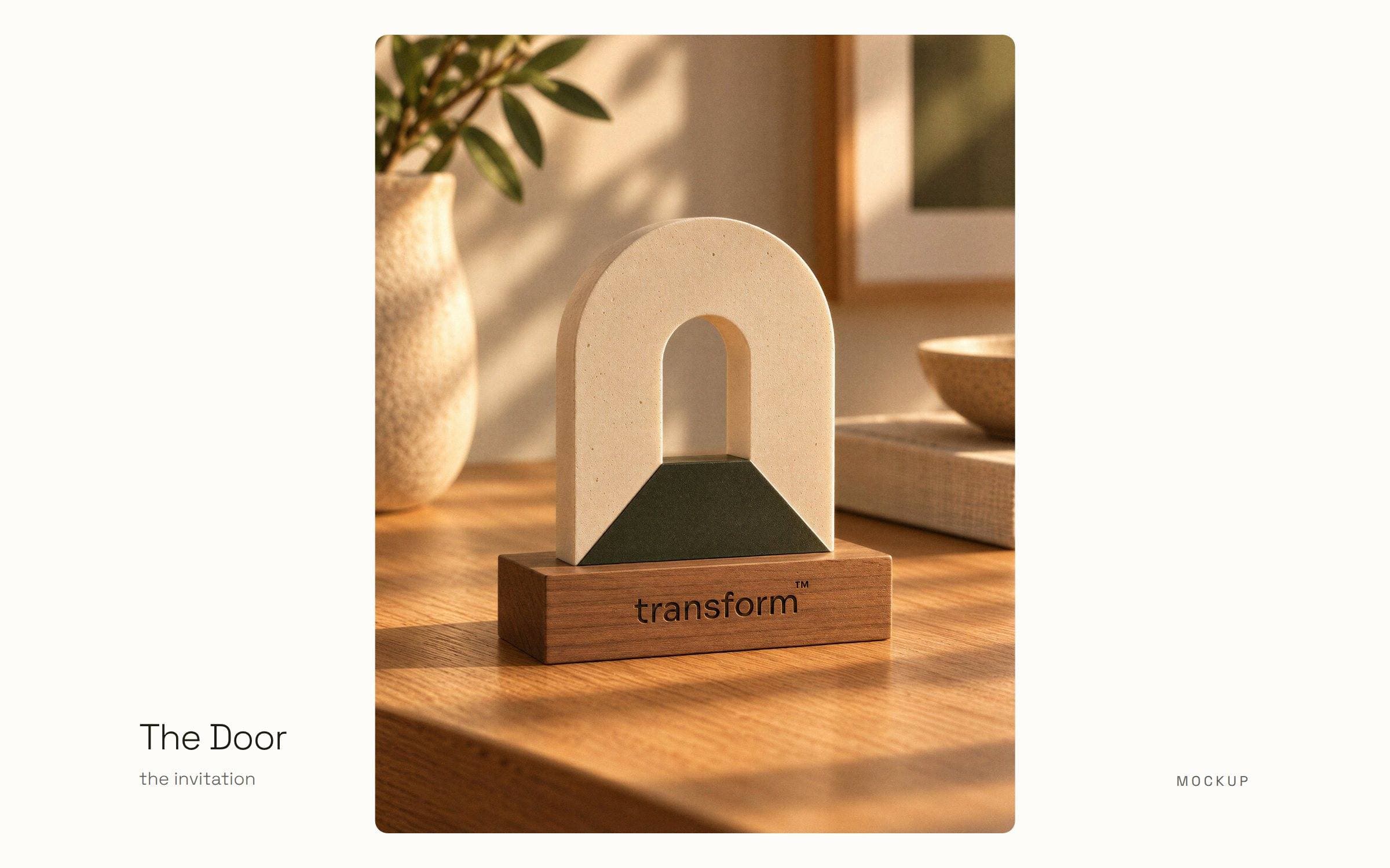
Context & challenge
Transform is for young adults who still believe after being hurt: spiritual, and tired of jargon, guilt and empty preaching. The brand had to feel like a place where faith can breathe.
My role
The whole brand: strategy, personality, verbal identity, manifesto, symbol, colour, typography and motion.
Process
- What I looked atPeople who believe but don't belong anywhere.
- What I foundFaith wasn't missing. A place for it was.
- What I chose, and whyFour things the brand never does (guilt, long sermons, jargon, decoration) and one symbol: a door.
Key decisions

A symbol that isn't born finished
Why: The brand is about a process, so the mark shows one.
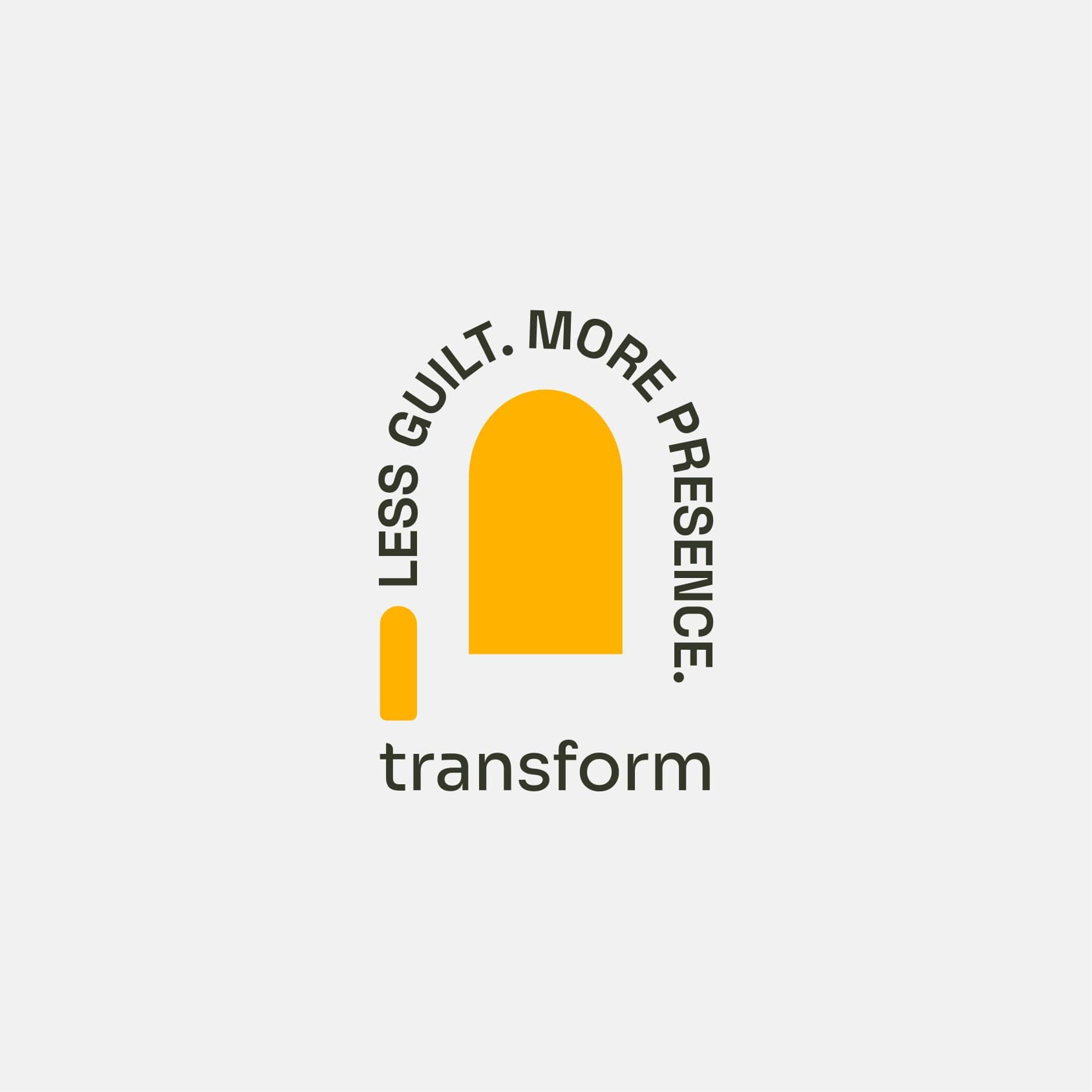
One shape, a colour per campaign
Why: The colour changes with each campaign; the shape never does.
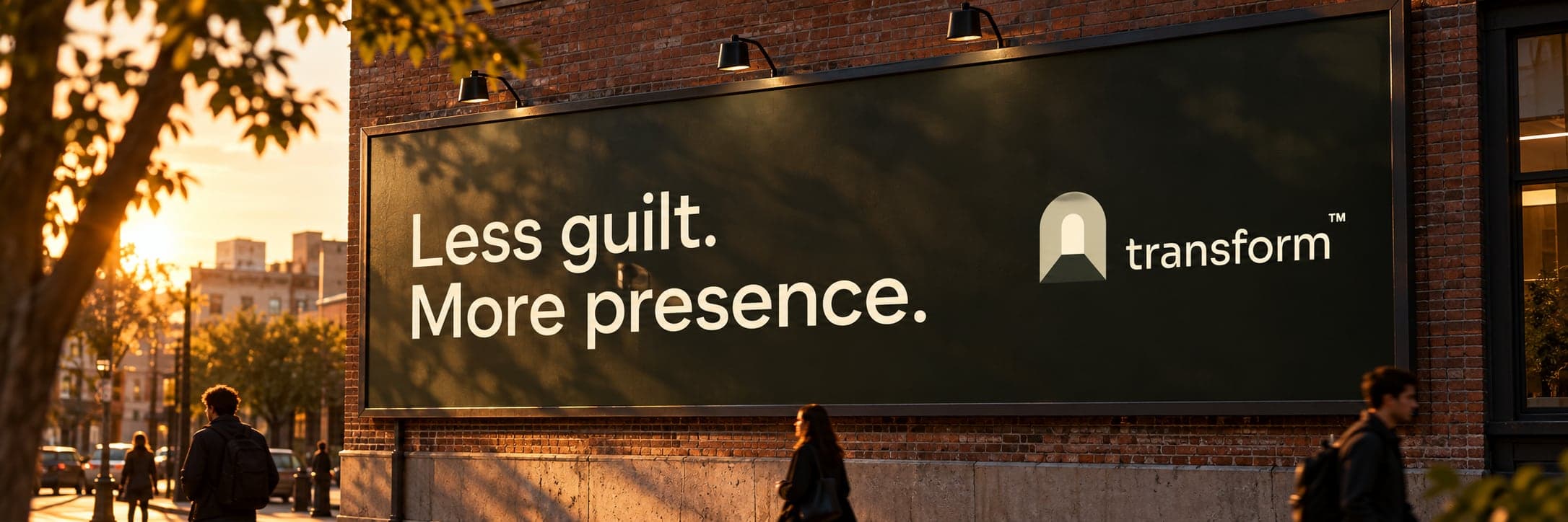
A voice before a look
Why: “Less guilt. More presence.” Every piece answers to that line.
Result
A complete brand platform the team can apply alone: manifesto, personality, verbal identity, the door in four beats, colour, type, icons and mockups of the brand in use.
Have a similar challenge? Tell me what you're building.
Next case →